
Presentations in the vividly saturated digital world of now have evolved significantly from simple data dissemination— they have become interactive sensory experiences. Leading this transformation is the dominant picture: a strong visual component that can turn a run of themill presentation into a remarkable one. The in depth approach of this thorough reference sheds light on why a strong image is beneficial for a presentation and offers practical advice for improving your pictures for presentation.
How A strong Visual Makes Your Presentation Stand Out
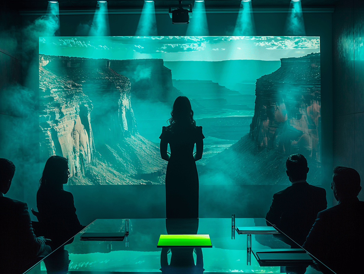
1. Creates an Immediate Visual Impact
In the first seven seconds of your slide, viewers form early impressions that affect their level of involvement all over your presentation. A strong first impression is established by a dominant image, which acts as a visual anchor that instantly seizes attention. A clear dominant image offers visual respite and enables the brain to digest data more effectively, in sharp contrast to cognitive overload audience feel with a messy slide loaded with bullet points.
2. Enhances Memory Retention Through Dual Coding
Dual Coding Theory from cognitive psychologist Allan Paivio contends that data presented both verbally and visually is processed via different means channels and thus multiple memory pathways are created. Studies reveal that events with powerful visual components are retained 65 percent more effectively than text only ones. A strong dual coding effect results from a prominent image, which greatly enhances your audience's capacity to remember your main points days or even weeks afterward.
3. Triggers Emotional Responses
Research in neuroscience shows that decision making and information handling depend critically on emotions. A strategically selected major image bypasses rational roadblocks and links straight with the emotional centers of the brain. This emotional appeal makes your speech not only more memorable but also more compelling since feelings sometimes propel behavior more strongly than logic alone.
4. Bridges Communication Barriers
Today's international commercial world presentations often span cultural and linguistic divides. A strong dominating image surpasses these obstacles to impart ideas that are universal and beyond mere words.
5. Establishes Professional Credibility
High-quality, thoughtfully selected dominant images signal preparation and attention to detail. By comparison, bad visual choices or generic stock images may damage your authenticity. Viewers are more inclined to regard you as an expert on your topic when they see your visual selections as elegant and intentional.
6. Accelerates Information Processing
Visually the brain processes things 60,000 times more quickly than textually. By means of a well planned dominant image, your viewers can almost instantly grasp difficult ideas, improving the efficiency and impact of your presentation. This visual shorthand lets you expand on subtle points instead of going over fundamental ideas.
7. Creates Memorable Anchors for Complex Ideas
When shown graphically, abstract ideas materialize. A major visual serves as a conceptual anchor, giving viewers a visual reference point for difficult ideas. This visual metaphor aids people in arranging information within a logical structure and keeping it in mind.
How to Make Presentation Pictures Better?
1. Select Images with Purposeful Intent
Every dominant image should serve a strategic purpose within your presentation:
Conceptual illustrations that visualize abstract ideas
Emotional triggers that evoke specific feelings aligned with your message
Data visualizations that transform complex statistics into digestible insights
Metaphorical imagery that creates powerful associations with your concepts
Rather than picking pictures strictly for their aesthetic sense, ask: “Does this photo help to uplift my story and strengthen my main message?”
2. Embrace the Rule of Visual Hierarchy
Visual hierarchy principles ensure your dominant image guides the audience's attention effectively:
Size: Make your primary image substantially larger than supporting elements
Contrast: Create clear distinction between the image and background
Position: Place the dominant image at natural focal points (typically following the rule of thirds)
Isolation: Surround important visual elements with negative space to increase their impact
3. Optimize Image Technical Quality
Technical excellence in your visuals communicates professionalism:
Resolution: For present screens, constantly use photos of at least 1920 by 1080 pixels.
Sharpness: Ensure that there are sharp, crisp lines free of blurring or pixelation.
Color calibration: For best viewing under presentation circumstances, fine adjustment of saturation, contrast, and brightness is needed.
Format compatibility: Verify your images display correctly across different presentation software and hardware
4. Leverage Color Psychology Strategically
Colors evoke specific emotional and psychological responses:
Blue: Promotes trust, reliability, and professionalism
Red: Stimulates urgency, passion, and energy
Green: Indicates balance, stability, and development
Yellow: Brings clarity, hope, and warmth.
Black: Communicates sophistication, authority, and exclusivity
Choose dominant images with color palettes that align with your intended emotional impact and brand identity.
5. Create Visual Consistency Throughout
Maintain visual cohesion across your presentation by:
Establishing a consistent visual style for all dominant images
Using complementary color palettes throughout your presentation
Applying consistent filters or treatments to create a unified visual language
Aligning image positions and sizes across multiple slides
This visual consistency creates a professional, polished impression and helps audiences follow your narrative flow.
6. Integrate Text and Images Harmoniously
When combining text with dominant images:
Use text overlays thoughtfully – ensure sufficient contrast for readability
Position text strategically in negative space areas of the image
Consider semi-transparent text boxes when necessary for legibility
Keep text concise – let the image communicate the primary message
The best presentations find a fine line between verbal and visual components, with every one enhancing rather than containing the other.
7. Source Images Ethically and Legally
Protect your professional reputation by:
Using licensed stock photography from reputable sources
Creating original photography or graphics when possible
Properly attributing images when required by licensing terms
Avoiding overused stock photos that appear in countless other presentations
8. Test Visual Impact Under Presentation Conditions
Before finalizing your presentation:
Preview slides on the actual presentation equipment when possible
View from different distances to ensure visibility
Check legibility under various lighting conditions
Solicit feedback from colleagues on visual impact and clarity
Advanced Techniques for Dominant Image Mastery
1. Implement Progressive Disclosure
Rather than revealing your entire dominant image at once, consider:
Starting with a portion of the image and gradually revealing more
Using animation to build upon the initial image
Highlighting different sections of the image as you discuss related points
This technique maintains visual interest and guides audience attention throughout your discussion.
2. Incorporate Multimedia Elements
Expand beyond static images by incorporating:
Subtle motion graphics that draw attention to key elements
Cinemagraphs – still images with minor animated elements
Interactive elements that respond to presenter actions
Before/after comparisons with sliding dividers
These dynamic visuals create memorable moments within your presentation.
3. Develop Visual Storytelling Sequences
Instead of isolated dominant images, create visual narratives by:
Designing image sequences that build upon each other
Using visual metaphors that evolve throughout your presentation
Creating continuity between slides through visual elements that carry forward
Building anticipation by foreshadowing images that will appear later
Conclusion
In a time when attention is the most precious commodity, being able to use strong imagery in presentations design services offers a major competitive edge. Using the methods specified in this manual will turn your presentations from dull data transfers into gripping visual experiences that connect with listeners long after you have stopped speaking.
Recall that a leading image is a tactical communications tool that raises your message, improves audience engagement, and raises your professional standing; it is not just ornamental. Thoughtfully chosen and skillfully integrated dominant pictures not only complement your words but also multiply their effect many times.
If you spend time improving your presentation visuals, you will see your power to inform, persuade, and inspire soar.
